
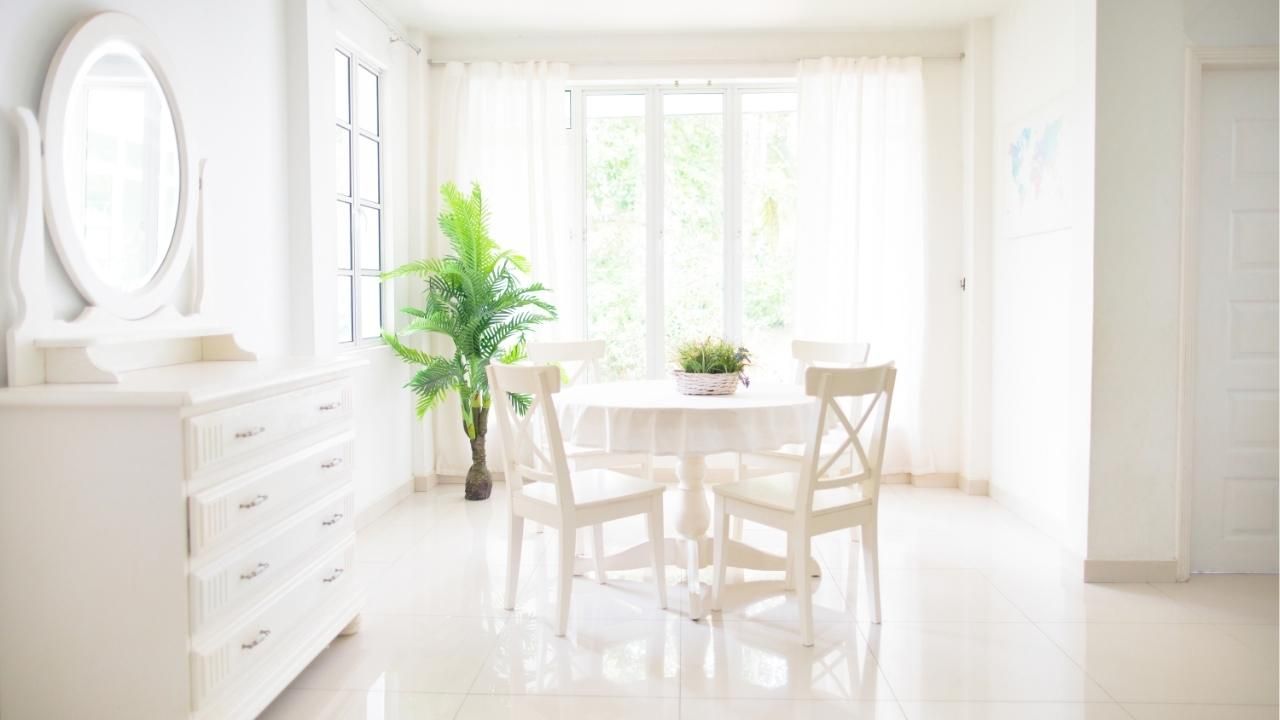
The Best Paint Colors to Brighten a Small Breakfast Nook
A small breakfast nook can feel cramped fast. Low light, tight corners, and heavy colors make it look even smaller than it is. The good news? The right paint color can completely change the mood of the space without knocking down a single wall.
In this guide, you’ll learn which paint colors make a small breakfast nook feel brighter and bigger, how undertones affect natural light, and what finishes work best in high-use dining spaces. Whether you’re hiring a house painter contractor in Central Oregon or tackling the job yourself, these tips will help you choose with confidence.
Soft Whites That Reflect Light Without Feeling Sterile
In a small breakfast nook, pure bright white can feel cold and flat. Instead, go for warm whites or creamy off-whites. These shades reflect natural light while still adding a hint of warmth.
Look for:
Soft ivory
Warm linen
Light almond
Subtle vanilla tones
These shades work especially well in nooks with:
Limited windows
North-facing light
Wood or farmhouse-style furniture
Warm whites create a cozy glow in the morning and prevent the space from feeling like a blank box. If your nook opens into a kitchen with bolder cabinets, a soft white also creates a gentle transition.
And if you’ve recently upgraded your outdoor area with a patio cover installation, soft whites inside can help balance the natural shade and keep the interior feeling bright.
Light Blues and Airy Greens for a Fresh Feel
If white feels too safe, consider pale blues or soft greens. These colors add personality while still keeping things light and open.
Pale blue works well because it mimics the sky. It reflects light gently and adds calm energy, perfect for slow mornings with coffee. Soft sage green brings a hint of nature indoors and pairs beautifully with wood tables and woven textures.
Choose tones that are:
Muted, not saturated
Slightly gray-based
Light enough to reflect natural light
Avoid dark navy or deep forest green in a small nook. Those colors absorb light and can shrink the space visually.
The key is subtlety. The goal isn’t drama, it’s brightness with character.
Pale Yellows That Warm Up Dark Corners
If your breakfast nook feels dim no matter what, pale yellow can be a game changer.
Soft buttery yellow reflects light and instantly warms the room. It’s especially effective in homes where morning light is limited. Instead of feeling shadowy, the walls appear to glow.
Stick to:
Creamy pastel yellow
Light honey
Warm straw tones
Stay away from neon or overly saturated yellows. Those can feel harsh and overwhelming in tight spaces.
This approach works particularly well in traditional or cottage-style homes. When done right, it makes even the smallest breakfast nook feel inviting and cheerful.
The Power of the Right Finish
Color matters, but finish matters just as much.
For breakfast nooks, consider:
Eggshell for a soft, subtle sheen
Satin for easier cleaning and durability
Breakfast areas deal with spills, fingerprints, and constant use. A finish with slight sheen reflects light better and holds up over time.
Professional prep also makes a major difference. Uneven surfaces, patchy coverage, or streaky edges will ruin even the best color choice. That’s why many homeowners rely on trusted local painting pros who understand how light plays in small rooms and know how to create a flawless finish.
A Quick Case Study: Small Space, Big Impact
One homeowner had a cramped breakfast nook tucked between the kitchen and a sliding glass door. The walls were painted a dark tan that absorbed light and made the space feel boxed in.
Instead of remodeling, they switched to a warm off-white with a satin finish. They also painted the trim a slightly brighter white to create contrast. The transformation was immediate. The nook felt larger, cleaner, and more inviting. Morning light bounced across the walls, and the entire kitchen appeared brighter.
Total cost? Minimal compared to structural changes. Impact? Dramatic.
Final Thoughts: Keep It Light, Keep It Intentional
Brightening a small breakfast nook isn’t about bold statements. It’s about choosing colors that reflect light, add warmth, and complement your home’s overall style.
Start with soft whites, explore muted blues or greens, and consider pale yellows if the space feels dark. Pay attention to undertones. Choose the right finish. And if you want the job done right the first time, get in touch with a professional who understands how to maximize light in small spaces.
Your breakfast nook should feel like the best seat in the house. Make it count.