The Science of Color Psychology Behind Your Home’s Paint in Central Oregon
How Paint Can Affect Your Mood
Color is all around us, and it has a profound impact on our lives, whether we realize it or not. From the clothes we wear to the cars we drive, from the food we eat to the places we live and work, color plays a significant role in shaping our experiences and emotions. This is the essence of color psychology, a field of study that delves into the ways in which colors affect human behavior, mood, and cognition.
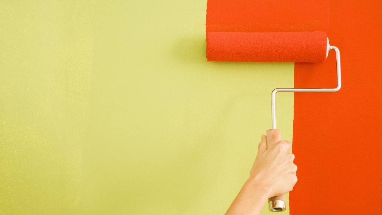
In this extensive exploration of color psychology, we will specifically focus on the use of color in interior design, particularly through paint choices. The colors you choose to paint your walls can have a transformative effect on the atmosphere and mood of your space. Whether you want to create a cozy, inviting bedroom or a productive and energizing workspace, understanding the science behind color psychology can help you achieve your desired ambiance. Our painters in Central Oregon are experts in color selection and application, ensuring that your vision becomes a reality with precision and artistry.
The Basics of Color Psychology
The Influence of Color on Emotions
One of the fundamental principles of color psychology is the idea that different colors can evoke different emotional responses. This phenomenon is not limited to humans; it is deeply rooted in our evolutionary history. For example, the color red, often associated with danger and excitement, may trigger a heightened state of alertness and arousal, while soothing blues and greens can evoke feelings of calm and relaxation.
Cultural Variations
While certain colors may have universal emotional associations, the cultural context can significantly impact how people perceive and respond to colors. For example, in Western cultures, white is often associated with purity and innocence, while in some Eastern cultures, it is linked to mourning and death. Understanding these cultural variations is crucial when designing spaces or products for a global audience.
Individual Differences
Individual differences also play a significant role in how people respond to colors. Personal experiences, memories, and even genetic factors can influence an individual's emotional reactions to specific colors. What might make one person feel joyful might evoke sadness or discomfort in another. Therefore, when considering color choices for a space, it's important to take into account the preferences and sensitivities of the individuals who will be using it.
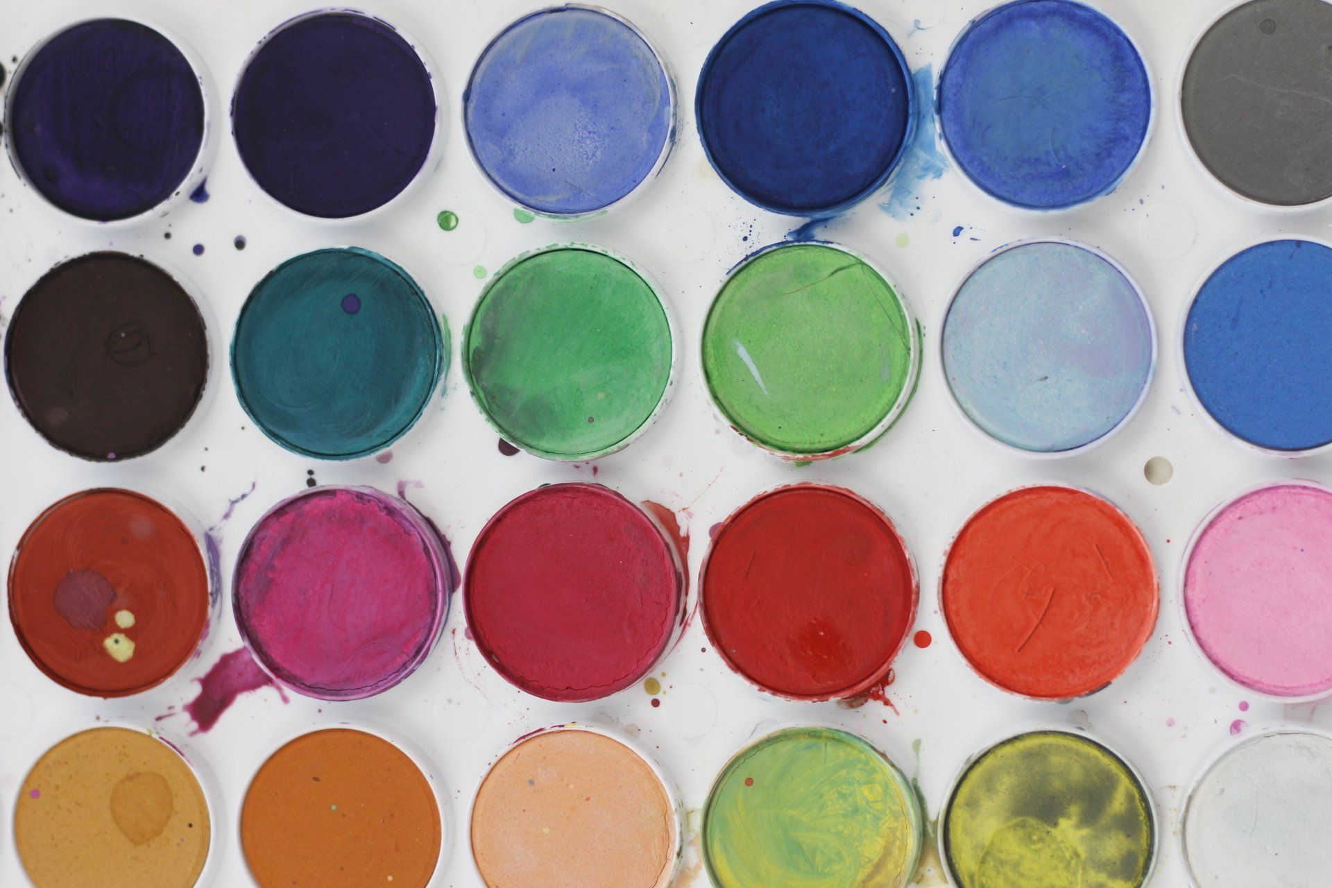
The Impact of Different Colors
Now, let's dive deeper into the specific effects of various colors on our emotions and behaviors:
Red
Red is a powerful and attention-grabbing color. It is often associated with strong emotions such as love, passion, and anger. In interior design, red can create a sense of warmth and energy, making it a popular choice for dining rooms and living areas. However, excessive use of red can lead to overstimulation and anxiety, so it should be used in moderation.
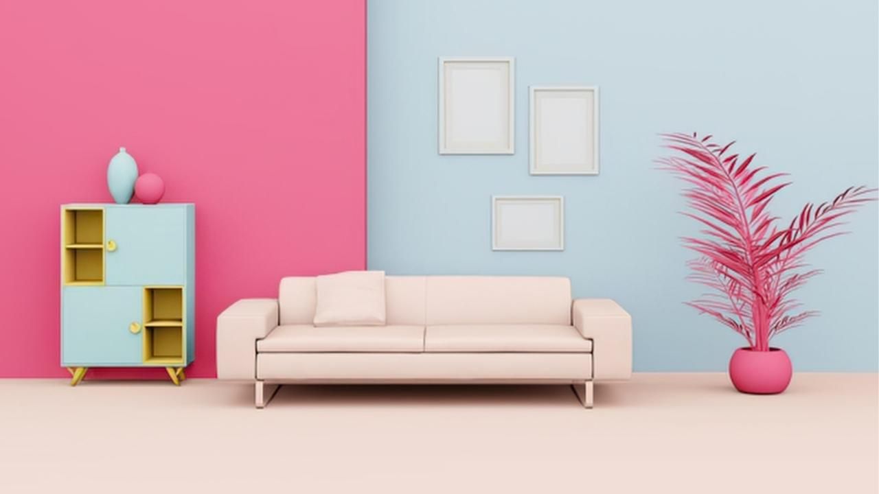
Blue
Blue is known for its calming and soothing properties. It is frequently used in bedrooms and bathrooms to create a sense of tranquility. Light blues can evoke feelings of serenity and openness, while darker blues may convey a sense of stability and sophistication.
Green
Green is associated with nature and renewal, making it an ideal choice for spaces where relaxation and rejuvenation are priorities. It can promote a sense of balance and harmony, making it suitable for bedrooms, living rooms, and offices.
Yellow
Yellow is often associated with happiness and optimism. It can add a vibrant and cheerful atmosphere to a room. However, excessive use of bright yellow can be overwhelming, so it's best used as an accent color or in spaces where energy and creativity are encouraged.
Purple
Purple is a color of luxury, creativity, and spirituality. Light shades of purple can create a sense of romance and nostalgia, while darker purples convey sophistication and elegance. It is a popular choice for bedrooms and creative spaces.
Orange
Orange is an energetic and enthusiastic color. It can stimulate creativity and social interaction, making it a suitable choice for playrooms and kitchens. However, like red, it should be used sparingly to avoid overwhelming the senses.
Pink
Pink is often associated with femininity and tenderness. Light pink can create a calming effect, while brighter shades can be fun and playful. Pink is a common choice for children's rooms and spaces intended for relaxation.
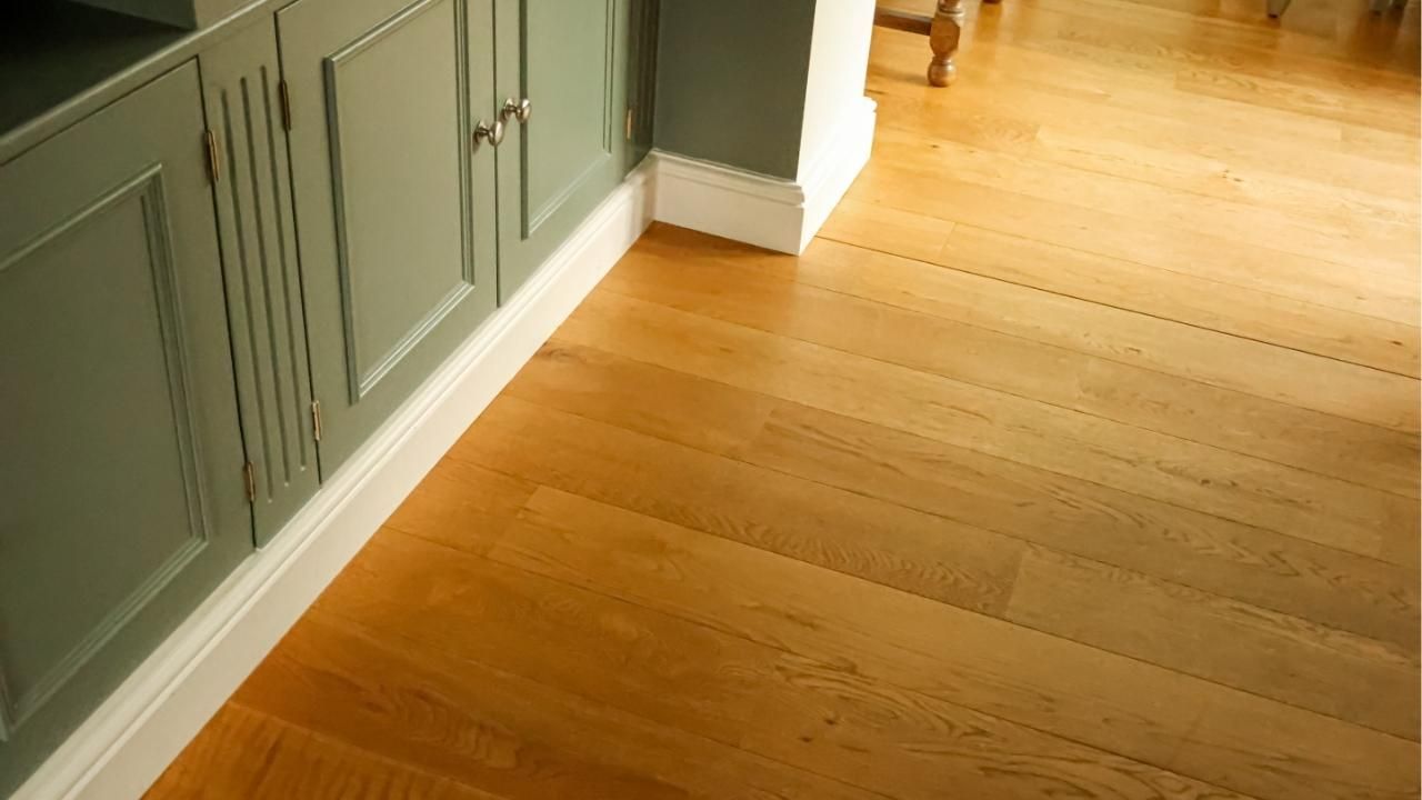
Brown
Brown is a color of stability and reliability. It is often used in furniture and flooring to create a sense of comfort and security. While it may not be the first choice for wall colors, it can be incorporated into the overall design to provide grounding.
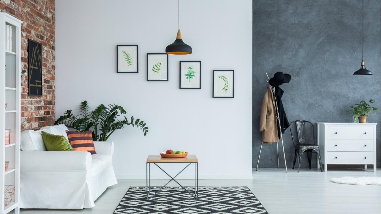
Black and White
Black and white are classic colors that convey simplicity and sophistication. White can make a space feel clean and spacious, while black adds depth and drama. When used together, they create a timeless and elegant contrast.
Choosing the Right Colors for Your Space
Now that we've explored the psychological effects of different colors, let's discuss how to choose the right colors for various rooms in your home or workspace:
Bedrooms
Bedrooms are spaces for rest and relaxation. Cool and calming colors like soft blues, greens, or lavenders are often recommended. Avoid bright and stimulating colors like red or orange, as they may interfere with sleep.
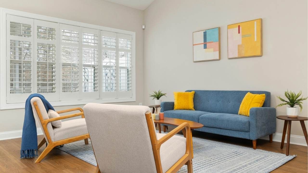
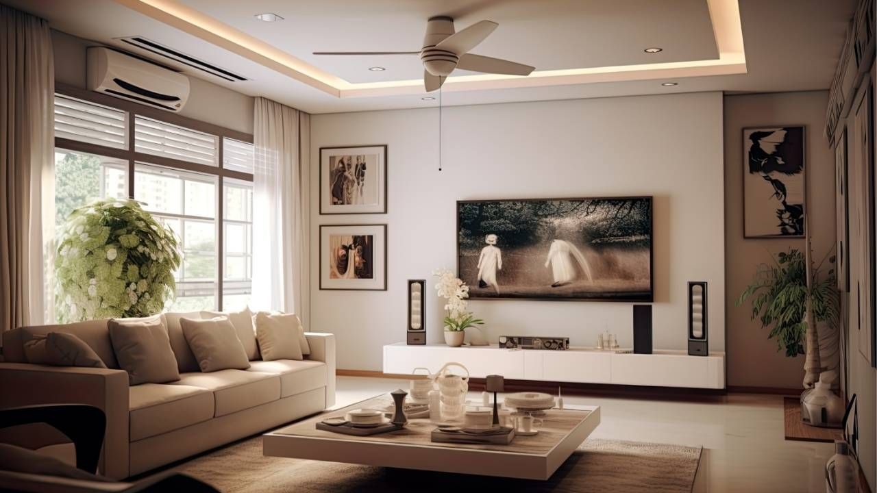
Living Rooms
Living rooms are places for socializing and entertainment. Warm and inviting colors like neutral tones, warm grays, or earthy greens can create a cozy atmosphere. You can add pops of color through accessories and artwork.
Kitchens
Kitchens are often associated with food preparation and gathering. Bright and energetic colors like red, yellow, or orange can stimulate appetite and conversation. However, balance these vibrant colors with neutral tones to avoid overwhelming the space.
Bathrooms
Bathrooms should offer a sense of cleanliness and relaxation. Soft blues, greens, or neutral colors can create a spa-like ambiance. Consider using white for a clean and timeless look.
Offices
In home offices or workspaces in Central Oregon, the choice of color can impact productivity and focus. Cool blues and greens can enhance concentration, while muted neutrals promote a professional and organized environment.
Children's Rooms
Children's rooms provide an opportunity for creativity and imagination. Bright and playful colors like yellows, pinks, and blues can stimulate creativity and playfulness. Consider using washable paint for easy clean-up.
The Role of Lighting
In addition to wall colors, lighting plays a critical role in the perception of color within a space. Natural light enhances the vibrancy of colors, while artificial lighting can alter their appearance. It's essential to consider the type and placement of lighting fixtures to complement your chosen color scheme.
The Psychological Effects of Color Combinations
The combination of colors can also have a significant impact on the overall mood of a room. Complementary color schemes create harmony, while contrasting schemes can add excitement. Understanding color theory and how to create pleasing color combinations can help you achieve your desired atmosphere.
The Evolution of Color Preferences
Color preferences can change over time and are often influenced by cultural and societal trends. Understanding these shifts in color preferences can be essential for keeping your space relevant and appealing.
Color Therapy and Healing
Beyond interior design, Ash Painting recognizes that color therapy is a holistic approach that uses colors to promote physical and emotional healing. While its scientific validity is debated, some believe that exposure to specific colors can have therapeutic effects.
The science of color psychology offers valuable insights into how
residential painting choices can affect our mood and well-being in various spaces. By considering the emotional and cultural associations of colors, as well as individual preferences, you can create environments that enhance your quality of life and the experiences of those who inhabit them. Whether you seek relaxation, creativity, or productivity, the careful selection of colors can help you achieve your desired atmosphere. Remember that the power of color extends beyond aesthetics; it can influence your emotions, behaviors, and overall sense of well-being. For professional guidance and expert application,
contact us to transform your space with the perfect colors.
Ash Painting Blogs